DIARY OF A RENOVATION: TOWNHOUSE UPGRADE WRAP-UP
Heads up: I use affiliate links for my fave products. If you click and purchase, I may receive a small commission at no extra cost to you.
Soo...this project ended up taking a lot longer than it should have. Sorry for the late post, but the contractor on this project made it a living hell. I take full responsibility for bringing him in and not being firm about getting rid of him as soon as he failed to meet his goals, but ultimately it was really the homeowners' choice to fire him and like a dysfunctional relationship, he kept stringing them along and they kept giving him chances in hopes that it would just get done. Word of advice (and I'm saying this for my own edification as well): as soon as you know things are going south...CUT THE CORD!!! It's not worth the agony and frustration and in the long run, saving a few bucks is not worth the gray hairs and the stress!In this wrap-up, I'll walk you through the before and afters of the project. Unfortunately, in putting together this blog post I realized there were some key after pictures that I didn't capture. It is an owner occupied property so as soon as a project was done, i.e. shelves or the kitchen, they were moving their things back in which is totally understandable, but getting that perfect picture for a portfolio proved challenging. Oh well...I think you'll get the gist of what we were able to do.To follow this project from start to finish, read this blog post to learn about the scope of the project and read these earlier blog posts to follow the progress in Week 1 and Week 2.So... a few longer weeks than expected later...here's what we ended up with.The hardwood was installed on the stairs. I'm not gonna lie...this process is time consuming. There are a lot of cuts and since the homeowners were living in the home during the renovation, there was traffic on the stairs when ideally there shouldn't be, but in the end, the stair nosing that we had stained looked seamless and it was a vast improvement over the awful tile that was there before. Don't you agree?
We added trim to create the look of wainscoting throughout the living room/dining area and painted the area from the chair rail to the baseboards the same color as all the doors and trim in the house. This instantly elevated the look and feel of the space. The hardest part is calculating the placement of the trim...this really puts your math skills to the test!
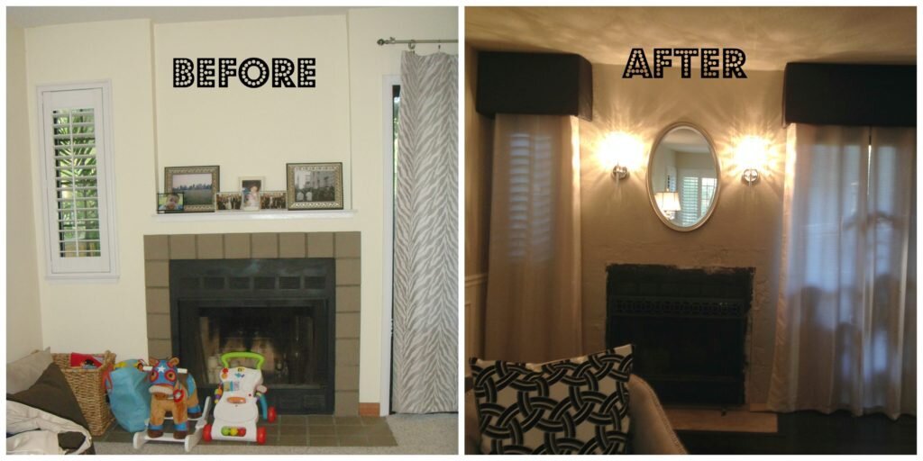
We closed up the recessed area on the upper half of the fireplace and added wall sconces. The fireplace mantel still needs to be installed, but with the addition of the new window panels and cornice valances, this area looks so elegant.
The kitchen got a complete makeover with lacquered cabinets, new cabinet pulls and drawer glides, a new glass tile backsplash, all the appliances were replaced with stainless steel options, and the microwave hood was removed and replaced with a chimney hood. Unfortunately, I don't have a AFTER photo of the space when it was completed...Arrghhh...FAIL!! =(
One of the best cosmetic changes was replacing the 80's style fluorescent light box in the kitchen with recessed lighting. By adding crown around the recessed box and painting the ceiling a slightly darker color than the walls, it added the contrast needed for the trim to stand out!
The laundry room got a makeover as well. We repainted the walls...twice! Unfortunately, the first color turned out too bubble gum so we repainted with a deeper teal color which was a lot more sophisticated. An hour into the painting project, my painter got called away on an emergency so I had to step in to get the job done. Working in tight quarters and jumping back and forth behind the washer and dryer, I swear there was paint in my hair until about two weeks ago!
We installed new floating shelves on the wall above the washer and dryer and we had the deep shelf that is sitting just above the washer/dryer custom fabricated. The homeowner really wanted a shelf where he could fold clothes and this really turned out very nice. Can you believe it's just stained plywood? Talk about beauty on a budget!
Of course, installation always has its challenges...
I was so in love with this area rug from Urban Outfitters...the print is so happy, it just makes you smile when you walk into this space.
And to add more personality to the room, we framed some of their 4 year old daughter's art. How proud do you think she is when she sees her work on full display?
So... here's a glimpse at what the townhouse looks like semi-post renovation. DINING ROOM: we purchased a used dining set off of craigslist and my amazing Design Assistant, Autumn, freshened it up with a new coat of paint and reupholstered the seats. The only thing that's missing is the L-shaped built-in bench seating that is planned for under the windows. Who doesn't love bench seating right?
LIVING ROOM: A black and white photo gallery of their beautiful family was hung above their sofa. The new color palette is so sophisticated. The sofa was one that they already owned. We just added decorative pillows, a graphic area rug and two club chairs that I scored at Home Goods.
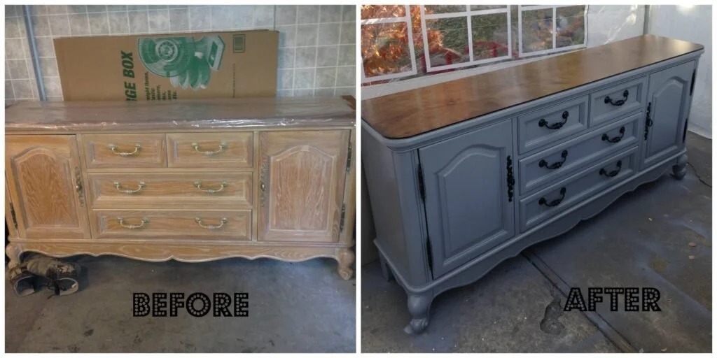
Again, I don't have an AFTER photo of this awesome piece of upcycled furniture, but here's a BEFORE and AFTER photo of what is now their media cabinet. It sits opposite the sofa right under the flat screen TV. They didn't want the typical off-the-shelf media cabinet so I found this piece on Craigslist and again, my Design Assistant extraordinaire, painted it and replaced the wood top that came with this piece with the same plywood used in the laundry room shelf and stained it to match the floors. The handles were sprayed with black glossy paint and voila...perfection!!
And finally, this desk area is exactly what the parents and the kids needed. The best part is this is a little corner that's tucked around the corner from the entry so you don't see it and any mess that may be on it when you come up the stairs. The desk is in front of the sliding door, but it's narrow and very lightweight so it can be easily moved out of the way as needed.
So there it is...what do you think? Pretty chic right? It's sophisticated and elegant for the adults, but still playful and child friendly for their two young children. Please leave me your comments below...would love to hear your feedback. Onto the next makeover...
Subscribe to the Behind the Renovation Design Journal
Sign up to receive the latest home renovation tips, resources, and inspiration!
RELATED POSTS


