FALL 2017 ONE ROOM CHALLENGE MASTER BATHROOM RENO PLANS | WEEK FOUR
Heads up: I use affiliate links for my fave products. If you click and purchase, I may receive a small commission at no extra cost to you.
So close and yet so far...aaahhhh!!! Living through any level of renovation is not for the faint of heart, that's for sure. The amount of dust floating around and just being displaced from your regular routine is challenging! Luckily for me, I've been out of town for the last week, although that didn't exactly relieve me from all the madness since I was living in a construction zone at a client's condo in Austin, Texas that I was updating and upgrading. Sometimes I wonder how I got myself into this type of lifestyle...If you missed the first three weeks of this challenge hosted by Calling it Home, catch up here: Week 1 | Week 2 | Week 3So, we are at Week 4 and here's what's been happening...
TILE PROGRESS
This is very exciting because it means we are starting to see what it will look like soon. Here's the flooring tile installed which is a 13x13 square charcoal gray porcelain tile in a straight set pattern. Seeing it run all the way under the vanity area already makes the space feel visually larger.
The tub/shower area is looking good! I'm so glad I decided to go with the 4x10 subway tile in a brick pattern. I had considered installing it in a herringbone pattern but the more I thought about it, I liked the classic look because it's timeless! The larger size fills up the room nicely and taking it from floor to ceiling makes the room feel much bigger.
The shampoo niche isn't finished because he ran out of material, but I love the taller niche for shampoo/conditioner and body wash bottles. The smaller one underneath is perfect for bar soap and razors! We didn't have this before so bottles lined the tub deck which just invited mildew - yuck!!I will have to say, I chose to change up the back of the niche wall by adding the marble herringbone. I know it'll look nice once everything is grouted, but I have to admit that my heart didn't skip a beat when I saw it installed. Part of me wishes I just kept it all the same with the subway tile. It'll be fine once it's all done, just sharing my thoughts. Sometimes, less is more.
VANITY PROGRESS
Here's the vanity area. All the cuts in the drywall has been repaired and mudded. The popcorn ceiling has been removed. He will have to do another coat of mud and then add the texture and then I can paint!
A lot will be happening next week. I'm actually hoping to be done by the end of next week...let's see how it goes. Say a little prayer and cross as many body parts as you can spare. I need to get the house back in order...I don't do well in messy spaces.
VANITY INSPIRATION
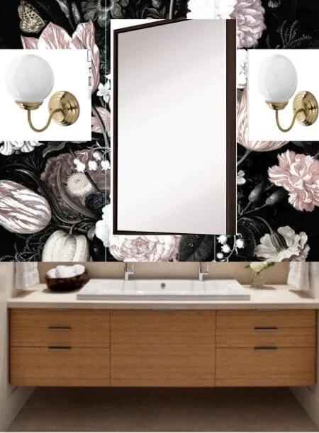
Before I wrap up for the week, let's talk a little bit about the vanity area. I did a poll on Instagram and Facebook about dark floral wallpaper which I am currently obsessed with. I'm planning to install this above the vanity behind the mirror from vanity deck to ceiling. The votes were a pretty even split between A and B so you'll just have to wait to see which one I ordered. The wallpaper is going to add some much needed visual interest in a fairly neutral space. I can't wait to see it up.
I created these mock-ups to see which mirror I liked better - gold with a little shaping or black and very modern. This exercise really helped me choose... which do you like better?
This vanity area was inspired by Beauté Nest Nail & Beauty Spa located in Woodbridge, Virginia. I mean how beautiful is the interior?
It's a little more glam and feminine than I want my results to be. I love the feminine quality of the wallpaper but I do want the finished bathroom to be a little more edgy. Can't wait to see it done!!!Come back next week for more progress reports! Thanks for following along!
Subscribe to the Behind the Renovation Design Journal
Sign up to receive the latest home renovation tips, resources, and inspiration!
RELATED POSTS


