
RESALE RENOVATION REAPS OVER $280K IN PROFITS
Heads up: I use affiliate links for my fave products. If you click and purchase, I may receive a small commission at no extra cost to you.
What if I told you if you invested 5 figures into your property, you would get a 420% return on your investment? Would you think I was crazy? Possibly. Probably. I'll bet the owners of my recent resale renovation project are laughing all the way to the bank.Hello...this house was listed for $1.299M...yes, that's $1.299 million dollars! and just SOLD for a whopping $1.58M. That's $281K above asking!! How do you like them dolla dolla bills ya'll!Granted, we are talking about prime Silicon Valley real estate but this is a modest 3 bedroom, 2 bath, 1420 sf house. Far from a mansion, but it is located in a very desirable school district. As the adage says, location, location, location. That is definitely a key factor in the success of this property, but before we get too excited, I'd like to take you on a little journey...a whirlwind journey that is of how we transformed this 1956 original ranch style home into the rockstar it looked like AFTER my team and I worked tirelessly for 3-1/2 weeks.To whet your appetite, here is the real estate marketing video tour of the property after an extreme makeover...enjoy!
Did you enjoy that? Isn't she pretty? Well...let me show you just how pretty she was BEFORE...just 4 short weeks before...This is what the exterior looked like. Not horrible, nothing exciting. We didn't make a lot of changes, but I do think what we did do gave it a face lift and made it look 30 years younger. We took down all the awnings around the front windows which immediately brought more natural light into the front room, we repainted the body of the house. It was a pale gray and we warmed it up with a deeper gray green color, painted the shutters and the front door a glossy black, and freshened up the trim in a warm white. This home's curb appeal is on point with that drought resistant rock lawn!

This is what the original front door looked like which really dated the house. The 12 panel solid wood door just screamed old fashioned. We replaced the front door, door bell, the porch light and the mailbox.

This is the new front door which we actually took out of another renovation project. That house was getting a new door from another project I worked on so their old door was the perfect solution for this project. I love when the timing works out like that (that never happens! ;) ) This also shows you what a difference it made to paint the door black. The white is lackluster...

Whereas the black really took it to another level...so chic!

Did you notice the little nip/tuck we gave the roof line? Scroll back up to see the exaggerated roof line over the walkway to the front door. Um...who invented this design? One of the worst inventions ever! We cut off about 4 feet of roofing and added new gutters and now the house looks more symmetrical rather than bent over like it forgot it's V8!

Okay...let's take a look inside. Warning, it's a little bit of a time warp. I will say, the house was owned by the same owner for the last 60 years and was kept in very good condition. It's dated, but otherwise, I've seen new homes in worse condition.
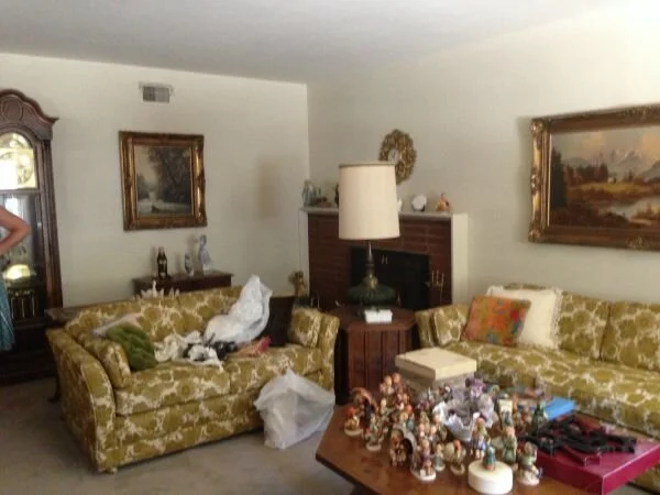

In the living room, we took down the old drapery and pulled up the carpet to reveal the original hardwood floors. There was some damage and some repairs we had to take care of but otherwise, the floors were in very good condition. Sanding them down and staining it a rich, coffee color completely changed the feel of this home. We added recessed lighting, painted it a warm gray color throughout and installed all new baseboards throughout.

We had one of these off-centered fireplaces in this room (again, why?!!! I don't understand!!). We gave it a face lift by cladding the brick with a stacked stone and topped it off with a reclaimed wood shelf with a live edge stained the same color as the floors. From the living room, you turned left into the kitchen. I have to be honest, I've seen this floorplan before and it's definitely not my favorite. The kitchen is in the center of the house and because the window is located in a recessed porch area with a roof overhang, it's always a really dark room. Plus, it didn't help that the old school lighting consisted of a solo light fixture above the sink area (see it in the photo?)

Directly across from the kitchen in the same room is a casual dining area with a ceiling fan illuminating that area. Lighting was definitely inadequate so we took down both lights and replaced it with 5 recessed lights in the space (3 in the kitchen and 2 in the dining area). Of course, that wallpaper came down and sadly, even the landline.

The kitchen cabinets were in good condition so we kept those and had them refinished, painted and glazed them in an off-white tone to help lighten and brighten the dark space. We added new knobs and pulls, replaced the tile countertop with a solid surface quartz countertop over a new sink and faucet, added a mosaic backsplash and new appliances. In particular, we removed the cabinets where the old stovetop used to be and installed a chimney hood vent above a freestanding gas range. Major update! We also removed the wall oven and added shelving in that space to make use of the dead space. We had planned on repurposing the doors from the cabinets that we removed, but unfortunately, they were too narrow. That's how renovation works...it's a fluid process. Great ideas don't work out for various reasons and you have to roll with the punches.

As you continue past the kitchen, there is a step down family room and access to the garage and the backyard.
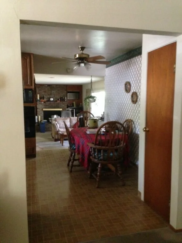
Did you notice the new tile flooring that replaced the icky old vinyl? No, actually that's linoleum. Vinyl is too hip for that.

I just love how this room turned out. The family room was definitely my favorite before and after story. We replaced the carpet with a luxury vinyl tile that look like planks of wood. Since this area has a slab foundation, this was the best solution. The Realtor suggested laminate flooring, but I'm just not real keen on laminate flooring, especially for a house in this price range. This vinyl flooring looks better and will last longer. It's the perfect solution for such a high traffic area. We also installed recessed lighting in here and had contemplated cladding the brick fireplace with tile, but ultimately, we ran out of funds and time so we just had the painter spray the brick the same warm white as the trim throughout the house. On either side of the fireplace, we installed reclaimed wood planks over the original wood paneling. Don't you love the wood detail?

Don't you love the wood detail?

Off the Family Room was the backyard. This is a quick look at the patio before...

And this is how open and airy it felt after the aluminum patio cover was taken down and all the plants were removed.

Okay...one really cool thing we did with the backyard was we had the grass sprayed to look like we actually had a healthy green lawn (see it in the background?). Sadly, with the drought, residents are not able to water their lawns and so they've become these ugly, yellow/brown patches of straw basically. The green is a topical spray and will last until you mow it off or it gets watered enough to lose its color (which it won't). I think it looks great from a marketing perspective. Now that's staging at its finest! Just don't step on it because the crunch sounds will blow our cover! Okay...back to the interior, down the hall is our hall bath. This room was in desperate need of an update. We couldn't salvage a thing. This was literally a "bath" room. There was no plumbing for a shower so you had one choice and that was it. Everything was dated - the tile, the mirror, the vanity, the flooring.

We completely gutted the space, relocated the toilet that was on the right hand side tucked into a little alcove over to the left side between the vanity and the tub and replaced all the finishes.

Now, the bathroom is fully functional with a shower system in place and the floorplan makes more sense. There was no need for the bump out and where the toilet has been relocated actually provides a little bit of privacy.

I loved this glass mosaic tile and was hoping to use more of it in this bathroom but the window placement on the wall made for incorporating a design challenging so we went with just the little bit you see here in the shampoo niche and as a backsplash above the vanity. Mandatory exercise of less is more, which worked out well.

The master bathroom was no prize either...it was tight and there was nothing grand about it. Relocating the toilet in the adjoining bath to the opposite wall allowed us to widen the shower in this bath by nearly 2 feet which made a HUGE difference. I found this glossy white 2 x 6 subway tile with a wave pattern on it which I wanted to use immediately.

We tiled from floor to ceiling and kept everything light and bright to maintain an open, airy feel. The vanity is also only 18"D which helped save 3" in floor space since a standard vanity is 21"D.


I won't go into detail about the bedrooms because all we really did there was replace the interior doors, door handles, bipass closet doors, ceiling light fixture and it received the same hardwood flooring treatment, baseboard and new door casing as the rest of the house. See all the pics on our portfolio page. I'll have to give you a rundown of how we accomplished this intense transformation in such a short period of time in a separate blog post, plus I was on vacation in Paris for a big part of it! Hope you enjoyed this tour and I'll see you again soon.
Subscribe to the Behind the Renovation Design Journal
Sign up to receive the latest home renovation tips, resources, and inspiration!

RELATED POSTS


