CHALLENGE WEEK SIX | MASTER BATHROOM REVEAL!
Heads up: I use affiliate links for my fave products. If you click and purchase, I may receive a small commission at no extra cost to you.
Welcome back to my One Room Challenge Master Bathroom Renovation. The day has finally come... REVEAL DAY!!! If you missed the first five weeks of this challenge hosted by Calling it Home, catch up here: Week 1 | Week 2 | Week 3 | Week 4 | Week 5For those of you who didn't know, Linda extended this season's challenge by a week to allow people who have been affected by all the natural disasters around the country time to catch up. I had every intention of writing a post last week and it just didn't happen. If you've ever lived through a renovation, cheers to you because it is NOT easy at all. It's very invasive, it's dusty and dirty and if you're like me who works from a home office, it's very disruptive to your daily life. To put it lightly, the last week has been all consuming to just get back to a normal life. I wanted to sleep in my own bed again, have access to my closets without sifting through dusty plastic covers and be free of Trades working in my house until all hours of the night. Mind you, these are people I work with regularly and that's the only reason they were working such long hours, but I wanted everyone out and that is the truth! I had the carpet cleaners here on Friday when all the work was supposed to be finished, but it wasn't! (#RenovationLifestyle) The carpets got cleaned anyway. The cabinet installers had to wear shoe covers on their feet to keep from soiling my freshly cleaned carpets. I spent the entire weekend cleaning, dusting, and organizing. I'm exhausted!!As painful as the process is, the end result is worth it. I LOVE my new and improved master bathroom. It honestly feels like a chic hotel suite.
The vanity area is stunning! I love my new custom solid walnut vanity. It's absolutely beautiful and one-of-a-kind! Thank you to All About Woodworks for bringing my vision to life.
This linear grain that runs across the cabinet face is purposeful. This is what a true custom piece looks like. It's not just scraps of wood pieced together. This is art folks!
SEVERAL THINGS I OPTED TO DO THAT MAKES THIS SPACE FEEL SO MUCH BIGGER THAN IT USED TO...
1) running the same tile from the vanity area into the wet area. If you recall, there used to be carpet in front of the vanity and vinyl tile in the toilet and tub/shower room.
2) exposing the flooring under the floating vanity also visually expands the space. it's only 10" off the ground but it makes a world of difference.
3) taking advantage of the height by wallpapering from the countertop to the ceiling and installing a mirror that is taller too. The old sheet mirror stopped short so your visual line was cut off prematurely. The black frame of the mirror recedes into the dark floral wallpaper so that your eye is not broken up by another color. That also gives the illusion of more visual and spatial flow.
4) removing the door into the wet area. This probably wouldn't work for most people but as I had previously mentioned, I rarely ever closed that door anyway. Not having that swing door makes such a big difference. I have full access to the wall where we hang our towels. The door doesn't get in the way of my bath mat. I don't have to keep propping it open with a doorstop. So glad we decided to frame out the doorway just as an opening.
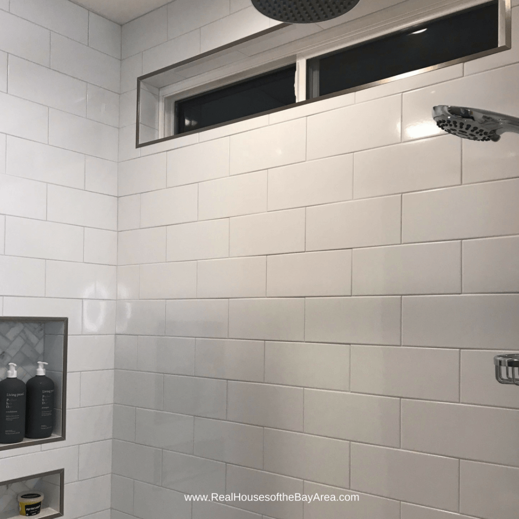
5) tiling in the shower up to the ceiling draws the eye upward. It's cleaner, and it allows me to hang the shower curtain higher too.
6) painting the walls a similar color to the floor tile. This again creates a constant visual flow.
LET'S TALK ABOUT SOME OF THE DETAILS...
Mixed metals - if you ever thought you couldn't mix metals, let this space show you that you absolutely can. I went with chrome on the sink faucet and shower fixtures and the bath hardware. I went with a brass wall sconce which contrasts nicely against the dark floral wallpaper. I opted for french gold cabinet pulls which carried that theme through, along with the brass detail on the new toothbrush holder and bathroom vanity organizer and I even found a vanity mirror in the same tone.
I also chose to spray paint the lids of the candy jars that I repurposed to hold Alexa's bath bombs a metallic brass finish.
Dark Floral Wallpaper - this trend is all the rage right now and I am officially obsessed. I knew that most of my finishes were going to be very neutral - grays and whites so I wanted a some pattern to spice up this vanity area. This wallpaper helped me accomplish just that. The shop I ordered from made it very easy by scaling the pattern to fit my dimensions of 60" x 60". Most of it is covered but I love what peeks through. It's a sophisticated, feminine touch.
Repurposing the Medicine Cabinet space - since I opted for wall sconces, a swinging door from a medicine cabinet was not going to work. I didn't want to lose the storage space so I had my contractor drywall the niche, texture and paint it and asked my cabinet maker to fabricate two shelves to fit into the niche. This repeats that wood element and I still have a very functional and unique storage niche.
Lighting - I am not a fan of bath light bars. Most homes have them but I knew that during this renovation, I was going to opt for a recessed light in the ceiling above the sink and two wall sconces on either side of a framed mirror. I love the wall sconces. It has a vintage vibe and the brass is a nice complement to the dark floral. These were a steal considering similar style fixtures are easily 8xs as much, if not more.
Shampoo Niche - I am a huge fan of anything that keeps clutter at bay. Old shower areas have a soap dish, if they're lucky. So what happens to all those bottles of shampoos, conditioners, body washes, etc? They pile up on the tub deck. Not only does it look messy but it also is a nightmare to clean around. Every single bathroom I renovate, I incorporate a shampoo niche somewhere recessed into the wall. If it can be hidden, say behind a pony wall, great, if not, it's strategically placed so it's easy to access and look how fabulous it is. I like a tall niche area for shampoos, conditioners and body washes and then a smaller niche for razors and soap. I highly recommend it! Oh and can we admire my plush, chevron shower curtain? It reinforces the chevron pattern in the shampoo niche. This was a splurge because it's the most expensive shower curtain I've ever purchased!!
Luxe Shower System - I have been installing these shower systems into every single bathroom remodel for the past few years and my clients absolutely love them. Now, it's my turn to enjoy an elevated shower experience. This shower system is fantastic. It's inexpensive, it can be retrofitted into your existing shower, and it provides you with a handheld shower wand (an absolute must) and a rain shower head (for the most luxe finish to your shower). I can't recommend this more than I already do. This is a must have for everyone!!!
BONUS: it comes with a soap dish so it freed up space in my soap niche for other items.
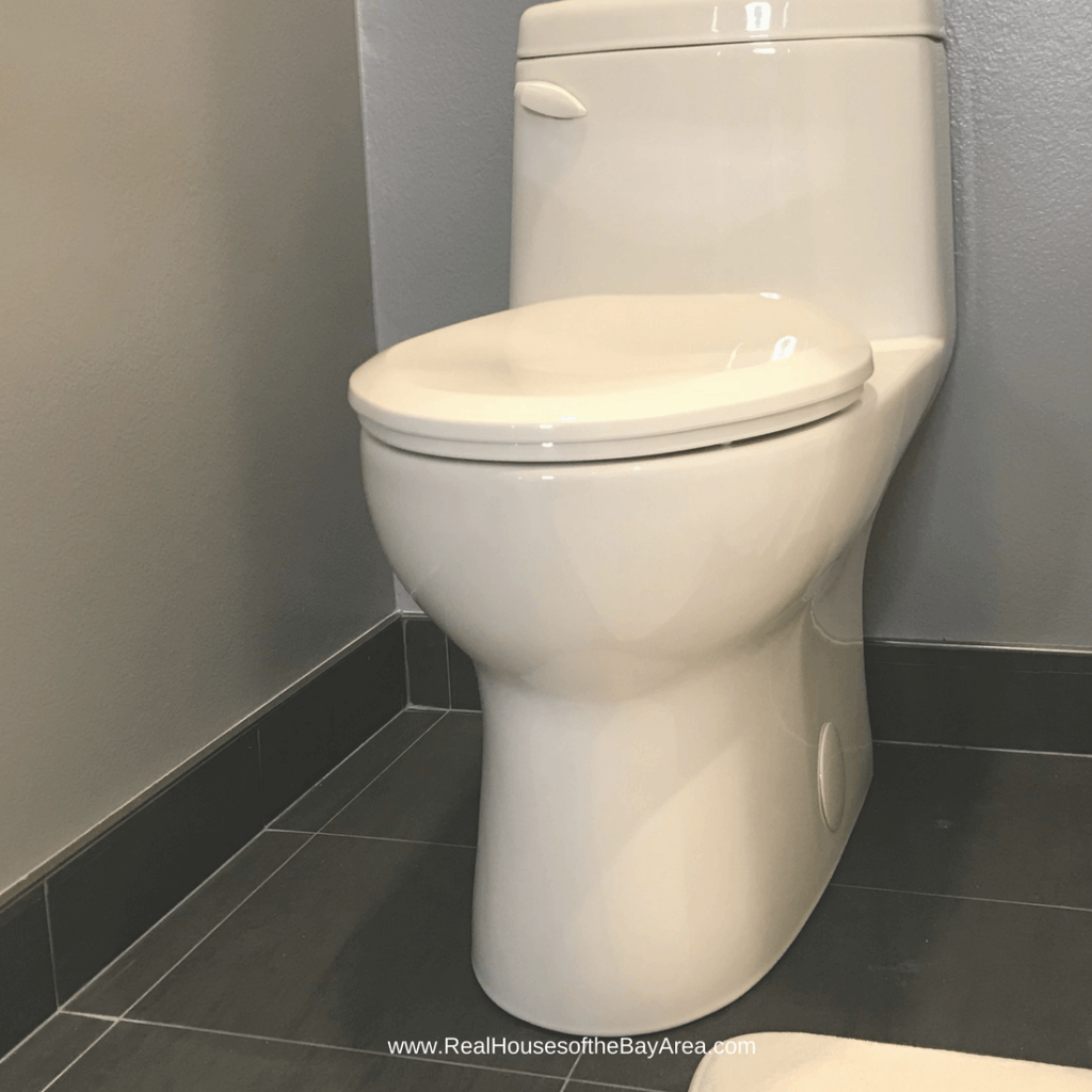
One piece Toilet with a concealed trapway - I don't know anyone who loves cleaning toilets. It's not a fun task so choose a toilet that has the least amount of gross factor. That means a one piece unit so there are no seams and crevices for yucky stuff to get into and a concealed trapway so that the side skirts are smooth. You don't see the guts and you don't have that nasty little plastic knob cover thing that gets rusty underneath. You know what I'm talking about. These are a little harder to install but it's so much cleaner and prettier.
Tiled Baseboards - I was staring at the bathroom and since the floor tile was a dark charcoal and I had planned to run the tile up the backwall under the floating vanity, I thought it would be a more cohesive finish (and practical for wet areas) to have a baseboard created out of the tile. This required a few more schluters to cap off the tops to give it a nice clean finished look, but I love the results. Now I don't have to worry about water damage to mdf baseboards! Can you believe it? I've been staring at the original ugly bath for years thinking about how to make it better and well, dreams do come true.
Special thanks to the following companies for partnering with me on this One Room Challenge extreme makeover:
Gerber Plumbing for the sink and toilet
Danze for the sink faucet, shower trim, tub filler, towel ring, robe hooks and tissue holder
Pulse Showerspas for the luxe shower system
eFaucets for donating the bathtub
All About Woodworks for donating this beautiful solid walnut vanity
Special thanks to E, my contractor for all his hard work and B and Y for partnering with me on this bathroom makeover. Thank you to everyone who has followed this journey. I will look forward to using this room every day. It's seriously better than most hotels. Join me next week for a follow-up post where I review some of the products used in this space. Want a space just like this?
SHOP THIS ROOM
13x13 Charcoal tile - contact us for order information
Floor Tile Grout - Bostik French Gray (unsanded)4 x 10 glossy white subway tile - contact us for order information
Subway Tile Grout - Bostik Silver Bullet (unsanded)
Shluter metal trim (brushed nickel finish - available in other finishes; sold at most tile and home improvement stores)
Solid Walnut Floating Bathroom Vanity - Custom Order (contact us to design yours)
Vintage Glass Wall Sconce in Brass Finish
Dark Floral Removable Wallpaper (also available as a traditional pasted wallpaper)
Wall Paint - Kelly Moore KM5816-2
Harrison Gray (satin finish)
Ceiling and Trim Paint Color - Kelly Moore 23 - Swiss Coffee (satin finish)
One Piece Concealed Trapway Toilet - Sold to the Trade Only - contact us for order information
60 x 30 R Drain Fiberglass BathtubTub
Rectangular Sink - Sold to the Trade Only - contact us for order information ; similar here
Subscribe to the Behind the Renovation Design Journal
Sign up to receive the latest home renovation tips, resources, and inspiration!
RELATED POSTS


