DIARY OF A RENOVATION: 1959 SUBURBAN RANCH HOME REMODEL WRAP-UP
Heads up: I use affiliate links for my fave products. If you click and purchase, I may receive a small commission at no extra cost to you.
Shame on me. I was trying so hard to keep up with blogging about my renovation projects and it has not worked out yet...sigh! I did document with progress photos, but again, capturing those perfectly staged After photos is hard to come by with real homes for real people who need to move in. That's the beauty of television...you can make it just perfect before they get to come back. Not so easy when homeowners are living in the home or need to move in immediately because their lease is up at their rental. So...here it is. I'm a few months behind on this one, but better late than never right? Now let me fill you on everything that happened since then...the cliff notes version...
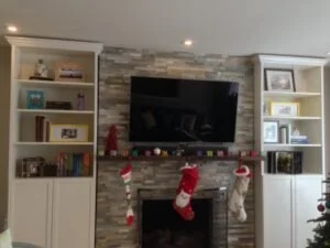
The Living Room: As I mentioned previously, we clad the face of the fireplace with stacked stone and added a reclaimed wood shelf mantel. You saw us pulling electrical for their TV and electronic components in the last post (see week 2) and as you can see, it turned out very nice. Because all the electrical was built into the wall, there are no unsightly wires and plugs hanging down. This is something that should be highly considered if you are planning a similar scenario for your own home. Nothing more aesthetically unappealing than a bunch of electrical cords dangling everywhere.
As you can see, we also created a built-in bookshelf look on either side of the fireplace. These are IKEA Billy bookcases that we hacked. It's an inexpensive alternative to custom shelving which would have cost $6000. I'll take the $600 version thank you very much!
The Dining Room: No major changes in this space other than a new light fixture, new window treatments, and hanging up art and a gallery wall.
The Master Bedroom: Biggest change in here is adding the wall sconces to the bed wall and changing out the ceiling light fixture. Because they had to cut into the wall to pull the electrical, we took the opportunity to paint that wall a slightly darker color from the rest of the room.
And my favorite feature of all are the sliding doors from the Master Bedroom into the bathroom and then the bathroom into the new walk-in closet. These are fantastic space savers for small rooms. You don't lose valuable real estate that's wasted by a traditional swing door. They just slide along the wall. It's also a more contemporary, streamlined look. We chose a milk glass door from the master bedroom into the bathroom. The opacity allows for privacy and the milk glass is a much better option than frosted glass which is not very fingerprint friendly. Here's a picture of what that wall looked like once the new walk-in closet and door opening was framed out. I did a lot of calculations to maximize the budget. Every extra inch height-wise and width wise caused an increase in the final product price as well as the manufacturing lead time. Plus, we had to make sure the opening was just big enough so that the hardware can be mounted and we recessed the track into the floor. See...a Designer's job is not just about shopping and making things pretty. There's a lot of things you don't see behind-the-scenes that if done incorrectly, can cause major delays and impact the budget.
Here's a shot of the guys installing the sliding doors. They were fantastic...very professional and totally knew what they were doing...how refreshing!
And here it is after!
And here's the one in the bathroom leading to the walk-in closet. We added a mirror on this which really helps to visually expand an otherwise very tight space and it's also functional. They now have a full-length mirror to check themselves out when you get dressed. I worked really hard to maximize every inch of this space. If we had a swinging door in here, there's no way we could have squeezed a double sink vanity into the room. With the sliding doors, we gained at least 2 feet of otherwise wasted space. Fist bump on that one!
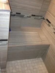
I think the smartest thing we did was create a larger walk-in shower to span the width of that window wall. That old neo angle excuse for a shower was pathetic. As you can see, we added a rain shower head...
A bench in the shower - great for shaving those legs and standing your child up in there if you have them with you.
and nice shower fixtures - these are by Hansgrohe.
The Hall Bath, also known as the kid's bath, got a complete overhaul as well. No more pink tile and we did move the plumbing to the opposite wall which allowed us to take down the partition between the tub and the vanity. This opened up the sight line and visually grew the space without touching the footprint. Without a full wall on both ends to attached a shower rod to, we opted for a ceiling mount rod instead!
The homeowners really wanted to keep the bathroom more gender neutral in case they had a boy in the future, but I found this shower curtain and fell in love with the fun colors and the contemporary floral pattern. I showed it to them and they liked it too. It gave just enough of a feminine touch with the pink flowers and it was the wow factor against the blue backdrop. Besides, I didn't think it was fair to their daughter to not have a fun girly space to enjoy because she might have a brother in the future. Spoiler Alert: they're pregnant and they're having another girl!!! =) Of course, I fall in love with this shower curtain and it's a standard size at 72" in length and there was only one available. 72" was too short because I wanted it to hang from floor to ceiling which creates a sense of height. I was determined to use it and I wasn't able to find anything else that I liked better so...I shopped for coordinating fabric and put my limited sewing skills to use. I added a solid color to the bottom which matched the watermelon colors in the floral design. Boy was I proud of myself!
And here's the BEFORE and AFTER of the vanity area. We installed a nice large medicine cabinet which is completely recessed into the wall and added two contemporary wall sconces to flank it on both sides. The floating vanity had to be set a little lower than we anticipated due to where the current electrical plugs were located, but it actually worked out well since it's at a more child friendly height.
And last but not least, I chose the IKEA Maskros Pendant light for their little girls room. All the contractor's thought I was crazy, but once it was installed, they all admittedly loved it! What you don't know is it took about 4 guys trying to figure out how to install this because someone bought it, tried to install it, returned it and who's the lucky chump that purchased the returned item? ME!!! Arrghh!! Needless to say, there were missing parts and that's why it didn't make sense. Ultimately, it cost more to have it installed due to the troubleshooting than it was to purchase the light... thank goodness it looks great in the room and so fitting for a girl's bedroom!
Well, that's it in a nutshell. The homeowners are very happy with the results and look forward to Phase 2 of the Renovation which is their kitchen.
I want to share some lovely things they had to say about working with me...
“When we first purchased our house, before we even moved in, we knew we wanted to make changes. However, we were so overwhelmed by figuring out what we could afford to do, what would look good, and the best places to spend our money within the house. Luckily, I mentioned this to someone who referred me to Alice. Alice immediately took away the stress. She had great ideas and definitely knew what she was doing. She understood everything about this process from the actual nitty gritty details of a remodel (like what hardware we needed to order) to the aesthetic details that make a home (like what throw pillows set the right tone). As a result of her help, we feel like we have a unique and personal house that looks fantastic. We also feel like she minimized our stress as much as possible during the remodel, saved us so much time by helping us with design decisions and managing the contractors, and saved us money with her incredible finds and advice about where to spend our remodel budget. Particularly for me, saving us all that time felt priceless! I don’t know how we could have kept our jobs or our family in tact during this process without her. My advice for those thinking of hiring Alice and her team is do not hesitate! If you already know you want a design person and/or project manager, she is it. If you are on the fence because of concerns over the financial investment you will more than get your money's worth through her ability to find great deals and get the most "bang for your buck" as well as coming up with unique ideas. If you are concerned about delegating something so personal, be assured that you will be very involved in the fun parts without being burdened by the logistics.”
Thank you so much Briannon & Tyler! Cheers to many years of happy family memories in your new and improved home! In the meantime, their young family is expanding and I'm thrilled that they have this adorable home to build memories in.
Subscribe to the Behind the Renovation Design Journal
Sign up to receive the latest home renovation tips, resources, and inspiration!
RELATED POSTS


