HOME RENOVATION TO SELL CASE STUDY WEEK 2
Heads up: I use affiliate links for my fave products. If you click and purchase, I may receive a small commission at no extra cost to you.
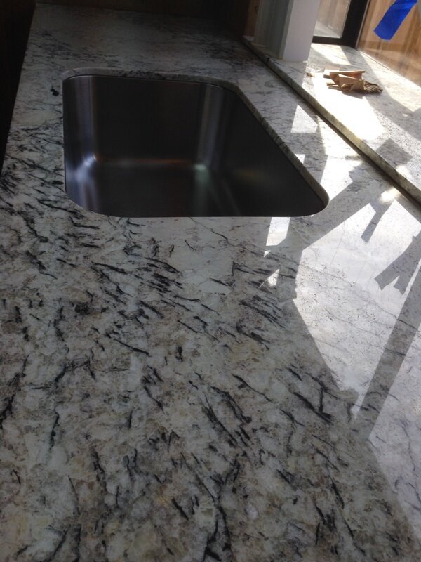
If you thought week 1 was a whirlwind, you should have lived the day in the life of me during week 2 which happened to straddle the Memorial Day holiday weekend. Did I get a day off...that would be a resounding NO! I did manage to get away for a few hours on Memorial Day to hang out with some friends by the pool so I'm not totally complaining. Let's talk about what we got accomplished during week 2...A LOT! We basically finished everything...starting with the kitchen. The granite countertops got installed.
The back splash was installed...isn't it beautiful? This is such a statement piece that it's worth the hard work that goes into the process. Remember, kitchens are one of the main rooms that help sell a house...you gotta give that WOW FACTOR!! The installers were fabulous. It took a good day and half of install and then they came back to grout. I love the granite counter and back splash combo don't you? It's so pretty. Oh wait...these progress photos don't do it justice. Just wait and see...
And here's the flooring installed. It looks so good. Everyone was so concerned (except for me) that it was too dark. I love how a dark floor grounds everything because I knew we were going light with the cabinets...you can see that it was in the process of getting painted here. That with the stainless steel appliances, the countertop, the backsplash, the new hardware...OMG...it's gonna look Faaabulous dahling...just trust me!
I decided to use the same flooring in the hall bath. It instantly transformed this room and made it look so much more sophisticated!
And here's the master bath flooring installed. See the cover over the toilet area? That's the homeowner putting one of the drawers from her vanity over the hole because she was afraid some little critters might come crawling out of it...LOL!
The master shower also got the glazing treatment just like the hall bath. The entire space looks bigger and brighter...good bye and good riddance to that pink tile. Don't remember it? Feel free to reference the initial post with all the BEFORE photos.
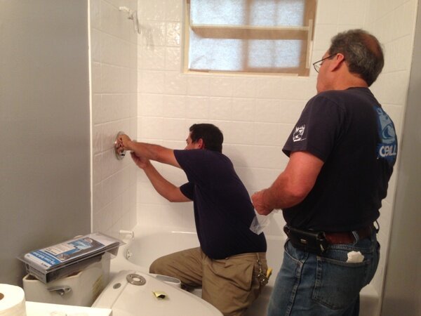
Renovations are ongoing learning experiences for me. Something as "simple" as changing out the shower fixtures is NOT so simple. Those kits they sell that say they're universal...I call bullsh*t! It's NOT! Luckily, I have a great contractor who was able to remove a few tiles around the valve area and were able to replace the fixtures without major construction...pheww!!!
Here's that master vanity being painted. I decided to do the same treatment as the kitchen cabinets. I agonized over this area trying to make it work within the budget. It felt very dark and claustrophobic in this area. Initially I was going to have this entire area ripped out and install a new double sink vanity, but that was too expensive. Then I was going to have the two tall cabinets cut down and run a new counter all the way across, but that was too expensive, so we just had to work with what we had and it turned out to be the best solution after all. I'm glad we didn't go through all the drama.
Okay, onto the nit-picky stuff, but it really pays off. If you look closely at all these knobs, they don't match! It's crazy. There are brass ones, there are copper ones, round ones, beveled ones...all different styles. The initial plan was to replace them all but that gets pricey. It's about $10 for dummy knobs and $15 for bedroom/bath ones that lock. All those $10 and $15 really start to add up so, the cost effective alternative was to spray paint them. 2 bottles of oil rubbed bronze spray paint costs about $11 and what a dramatic difference!
It's a much more cohesive view when you look down the hall now. Oh and we replaced all the lighting throughout the house.
The living room ceiling fan was replaced by a more contemporary drum style chandelier.
I decided to have the front door stained a darker espresso finish. Doesn't the color look so much richer and "expensive" as the homeowner would say.
Again, nothing is as easy as it seems. We replaced all the acrylic light diffusers in the rec room because the old ones were yellowed from the fluorescent lights. I thought you just had to lift them out and put in the new ones. No these were encased in frames and the new ones needed to be cut down to size which took a little bit of effort. How many guys does it take? The answer is 4 plus me, but after that first one, they were on a roll! Warning: the old ones get really brittle from age so be careful when removing them. The new ones are flexible and easier to work with.
To maximize and to stay on budget, we chose to have the carpets in the rec room cleaned rather than replacing it. All I can say is...WOW!!! Worth every penny wouldn't you say?
Something else worth every back breaking dollar is having the Junk It Removal service come take away all the renovation crap and all the extra garbage and junk that had accumulated over the years...even things that they inherited from the previous owners 13 years ago! I highly recommend Ivan and his team. They load it all up quick style, clean up after themselves and haul it away. They even set all the metal aside and came back to pick it up and bring it to get recycled. I was so happy to see them and after they were done, I could see the light at the end of the tunnel. Looking at all the garbage was making me soo uncomfortable. I was literally pacing (it's a disease I tell ya!)
And last but not least, I spray painted the house numbers and the mailbox using the same oil rubbed bronze spray paint...it's all in the details!
Come back to see all the before and afters from this project in the next post. Week 3 is all the final touches and it's showtime...house is officially on the market! See you then!
Subscribe to the Behind the Renovation Design Journal
Sign up to receive the latest home renovation tips, resources, and inspiration!
RELATED POSTS


